WEEK 1 S2: Digital Cityscapes
- Jan 27, 2019
- 2 min read
Updated: Feb 28, 2019
Further from exploring my personal digital environment in week 7; I undertook a task of illustrating digital cityscapes for all of DS1. This task helped me realise the diveristy of the digital interactions that we all have, but at the same time, I also realised trends and patterns within the sets of apps used.

The Methodology:
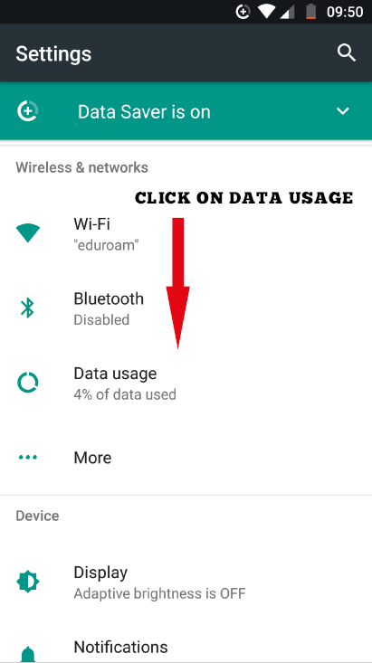
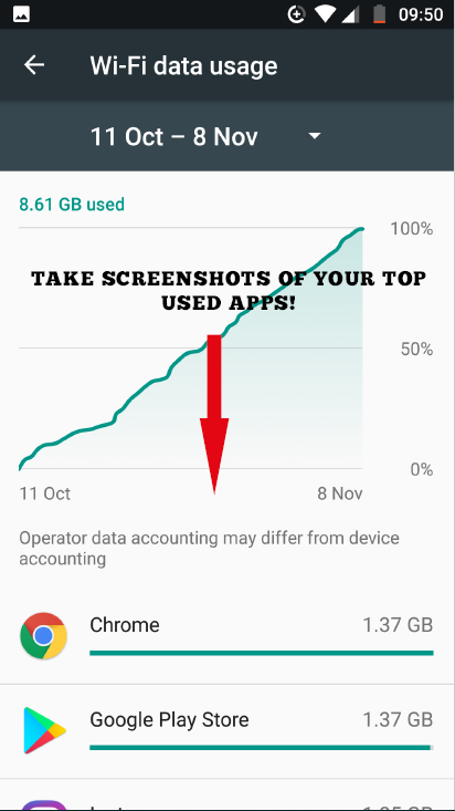
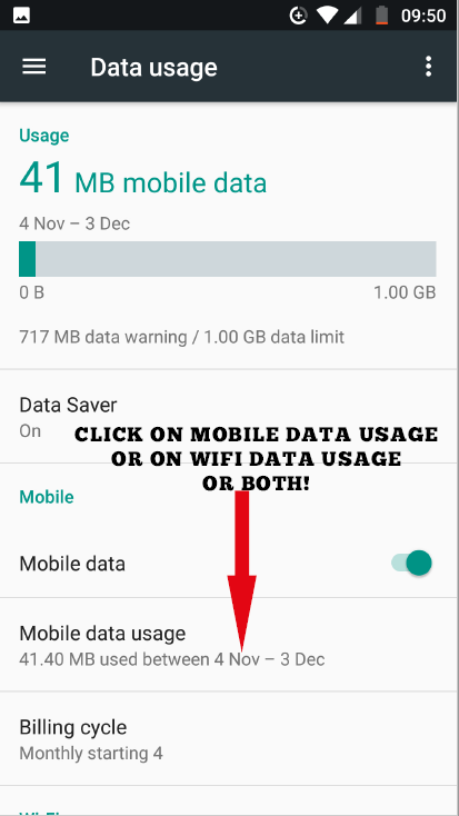
The process began with first collating all of the data from each member of DS1. This involved each person sending screenshots of their data usage (wifi, 3G or both). This information had both the app and the amount of data that the app used. Below are the instructions that I gave to people using Android devices:
Categorisation:
I then placed this information into a spreadsheet, assigning each app it's rightful 'owner'. For example, WhatsApp & Instagram being owned by Facebook, and YouTube being owned by Google.

Dividing each app into the owner allowed for a system of categorisation which meant that cityscapes could be compared and also (eventually) combined into one image to represent all of the cityscapes in DS1. It also meant that within each cityscape there could be 'neighbourhoods', where each grided unit of grass could represent a certain app 'owner' and each of the towers could be the apps within that categorised group. Therefore the cityscape would be read as:
All the apps used by the user
Neighbourhoods categorised by the app 'owner'
Apps within the neighbourhoods represented by individual towers
The towers:
Each tower represents an app. The towers are colour coded according to the categorised owner of the app. This allows for a limited palette within the cityscape, as if each tower / app had its own colour, it would be difficult to read the data. The disadvantage of this method is that it is not possible to see which individual apps were used within the app. However, with some of the categories, the owner only has one app (for example Pinterest being both the owner and the app). Therefore, this disadvantage is mitigated in a way, as most people can read the diagram and understand which app is being used.
Each storey or block on the tower represents 1% of data usage of the user. The higher the tower, the more data that app uses. The majority of users in DS1 have at least one tower that rises over 25 storeys, which shows that the data usage may not be equally spread amongst different apps. This could be for a variety of reasons:
Frequency of app usage
Amount of data consumed within the app (videos taking far more data than accessing text)
Uploading vs downloading data
This data was represented in Rhino, through using different layers for each app and colours corresponingly:

Before being transferred to Illustrator to amend lineweights, and Photoshop for colours and post-production:

The final digital cityscapes can be seen below:
The final collated DS1 Digital Cityscape:


Yes I think so, I would need to figure out which units I would measure. But maybe if I surveyed which items people would want to have repaired or are happy to share, and used that to quantify how the size of the spaces then it could work! I would like to link this work.
Could this methodology be used to appropriate the buildings at the mini plant? This reminds me a bit of your drawings of the workshops inside the building.